[ UX Design ]
Reaktor Case Assignment
TargetReaktor Pre-assignment
RoleUI/UX Designer
Tech & Tools
[Figma][UI/UX Design][Map Interfaces][Prototyping]
[ The Assignment ]
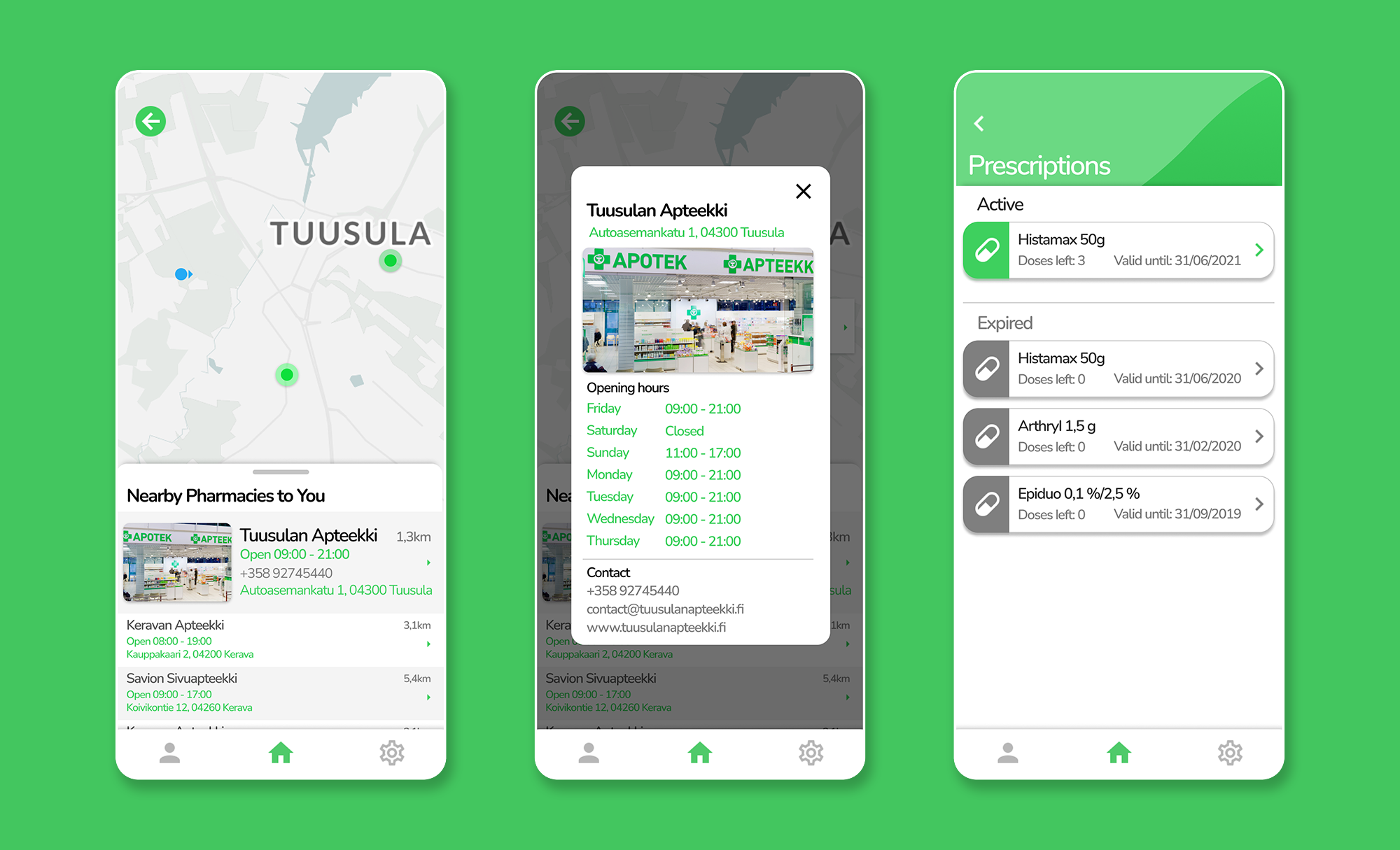
Design a user-friendly interface for checking prescription validity and locating the nearest pharmacies that have the medication available in stock.
Finding a pharmacy with your exact prescribed medication in stock is historically opaque — users typically call pharmacies one by one or drive between them, wasting time and energy. This pain is sharpest for elderly patients and those with chronic prescriptions.
Rather than a list of results, I designed a Google Maps–style view where pharmacies are instantly color-coded: green for in-stock, grey for unavailable. One tap on any green pin surfaces stock details and a "Get Directions" button using the device's GPS.
"The key insight: don't make users read a list — let the map answer the question at a glance."