[ Product Management ]
Wolt Grocery Pickup
TargetWolt Product Manager Pre-assignment
RoleProduct Manager / UX Strategy
Tech & Tools
[Figma][UX Strategy][Product Management]
[ The Assignment ]
A Product Manager pre-assignment for Wolt: conceptualize a Grocery Store Pickup system, map out how couriers and store employees communicate on collection orders, and handle edge cases like missing or substituted items.

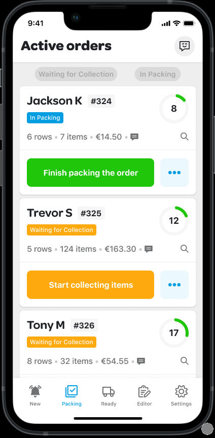
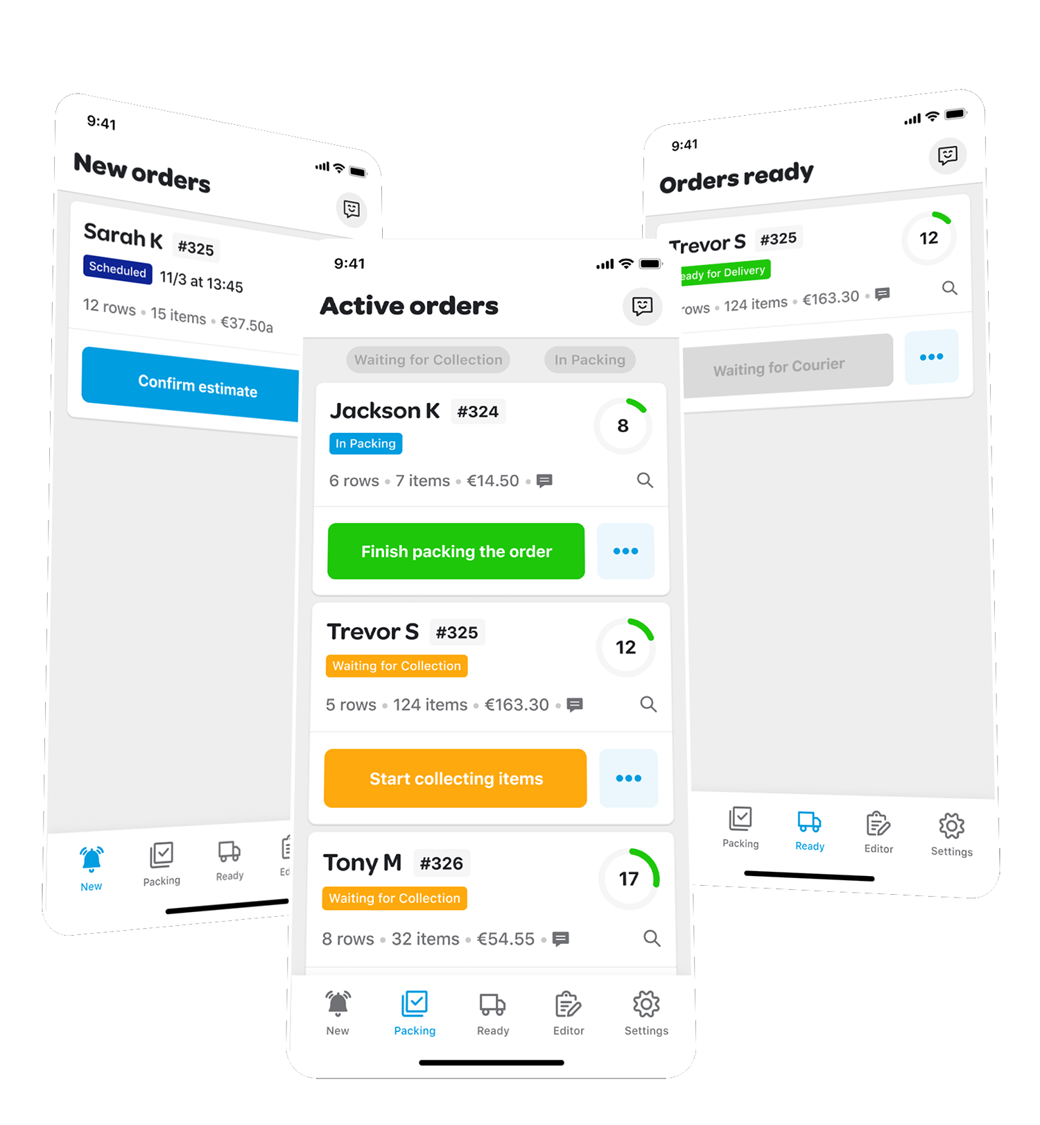
Experienced couriers (power-users) frequently handle multiple simultaneous pickup orders. The existing app forced them to navigate back and forth between individual order screens — a slow, error-prone workflow that hurt both speed and accuracy.
I added a persistent button in the header of the collection order screen. Tapping it surfaces a quick-access overlay listing all active and ready orders — letting power-users jump between them without losing context or navigating back.
The solution required no new mental model: the overlay mirrors the existing order card structure, just surfaced on demand.